

Data is very important for companies. It helps them make smart decisions, find important information, and grow strategically. Research shows that data quality costs the United States about $3.1 trillion every year if data quality needs to be improved. So, having good data is very important for businesses.
That’s where Microsoft Power BI comes in. It’s a perfect tool for businesses. It helps them turn their data into cool, easy-to-understand dashboards. These dashboards let people bring together data from different places, see trends, and show information in a way that looks good. This article will discuss a Power BI dashboard, why it’s useful, and how you can make one for your business.
Explain What is Power BI
A Power BI dashboard is a complex screen that shows important data from various sources all in one place. It allows people to examine a company’s most important metrics. Consider it a command center where you can quickly check how things progress.
We use Microsoft Power BI tools such as Power BI Desktop and the Power BI service to create these dashboards. You can combine information from many sources such as databases, spreadsheets, and web services to develop these dashboards.
Power BI includes strong data modeling and visualization tools for converting raw data into useful visual representations.
Advantages of Creating and Using Power BI Dashboards
Power BI dashboards have various advantages that allow businesses to make data-driven decisions and obtain valuable insights. Here are some of the main benefits:
Visual Image
Power BI dashboards offer an easy-to-use and visually appealing way to present data. Charts, graphs, and maps are visualizations that help people comprehend complex information and quickly identify patterns or trends.
Centralized Approach
Dashboards allow users to track important metrics and performance indicators in one location by combining data from several sources into a single display. Comparing this centralized view to manually analyzing data from several sources, you can save time and effort.
Real-Time Observation
With Power BI’s support for real-time data streaming, businesses can continuously monitor their metrics and data. This function allows prompt detection of alterations or irregularities, facilitating fast decision-making and preventive measures.
Interactive Analysis
Power BI dashboards allow users to engage with them through drill-through actions, filters, and other interactive features. Deeper data exploration and analysis are made possible by this interactivity, which helps users find insights and provides answers to certain business queries.
Cross-Platform Accessibility
Desktop computers, mobile devices, and web browsers are just a few platforms and devices that can access Power BI dashboards. This adaptability improves productivity and teamwork by allowing users to remain connected and aware of their data from any location.
How can we create a Power BI Dashboard?
In Power BI, there are multiple methods for creating a dashboard. One can be made entirely from the start, as a report, dataset, or by copying an already-existing dashboard. Let’s start building a dashboard that connects existing report visualizations step-by-step.
Select “more options (..) > Edit” after opening a report. This opens the report in the editing mode.

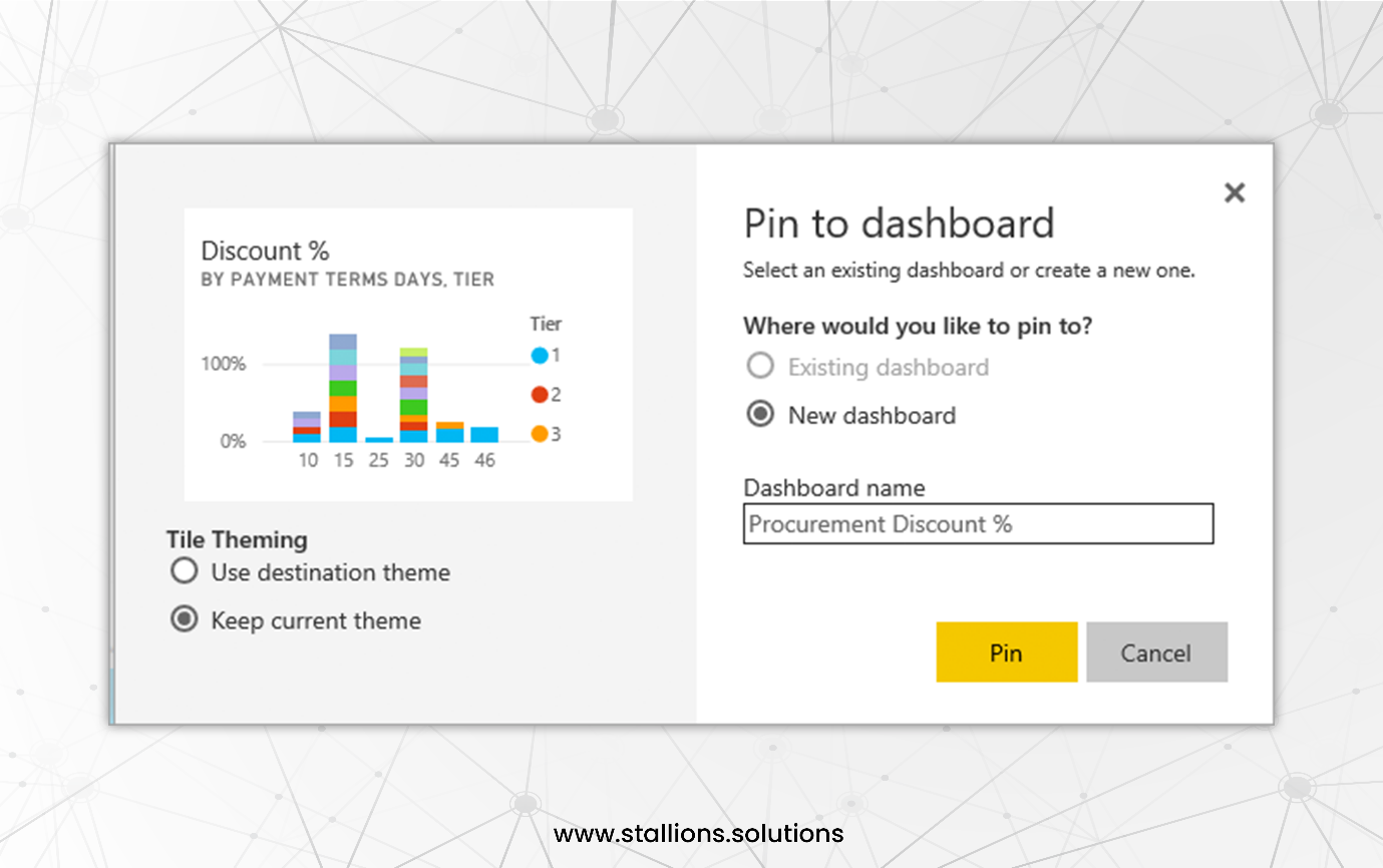
Hover over to see the various potential visualization choices. Click the “pin” icon to select the visualization you want on your dashboard.

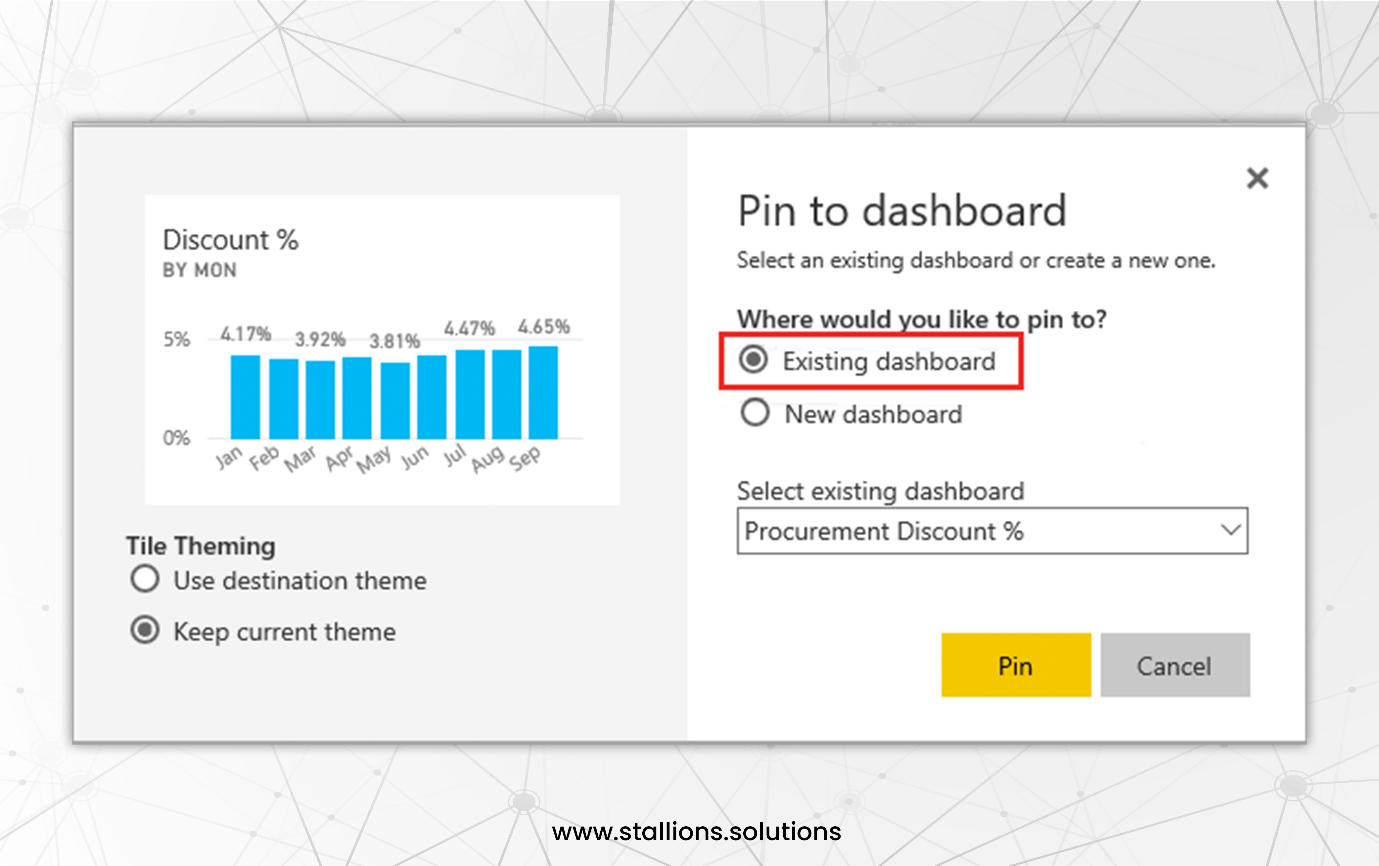
To pin, select a new dashboard or one that already exists.
For an existing dashboard
Select the name of the dashboard using the dropdown menu. Remember that the dashboard shared with you won’t be shown in the list.
For a new dashboard
Type the name of the new dashboard.
There’s a chance the item you’re pinning already has a theme. You can apply a new theme or stick with the current one.
Use Destination Theme: The theme of the dashboard.
Keep Existing Theme: The theme of the report.
Power BI generates a new dashboard in the current workspace when you choose “Pin.” The screen displays this after the message “Pinned to the dashboard.”
Select “go to dashboard” and then “save” after that.
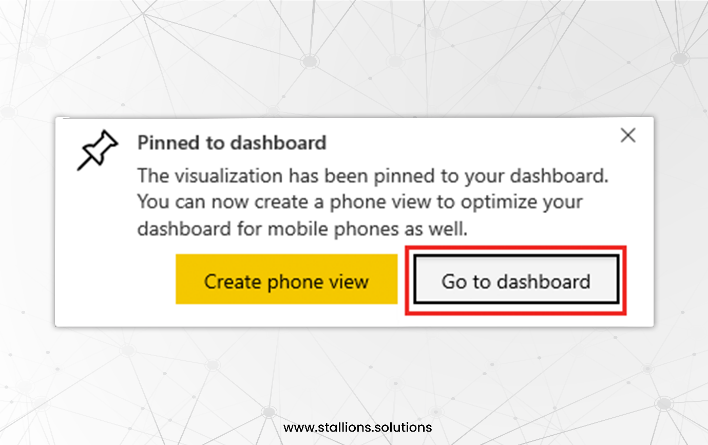
The visualization you pinned will be the only tile displayed when Power BI opens the new dashboard.
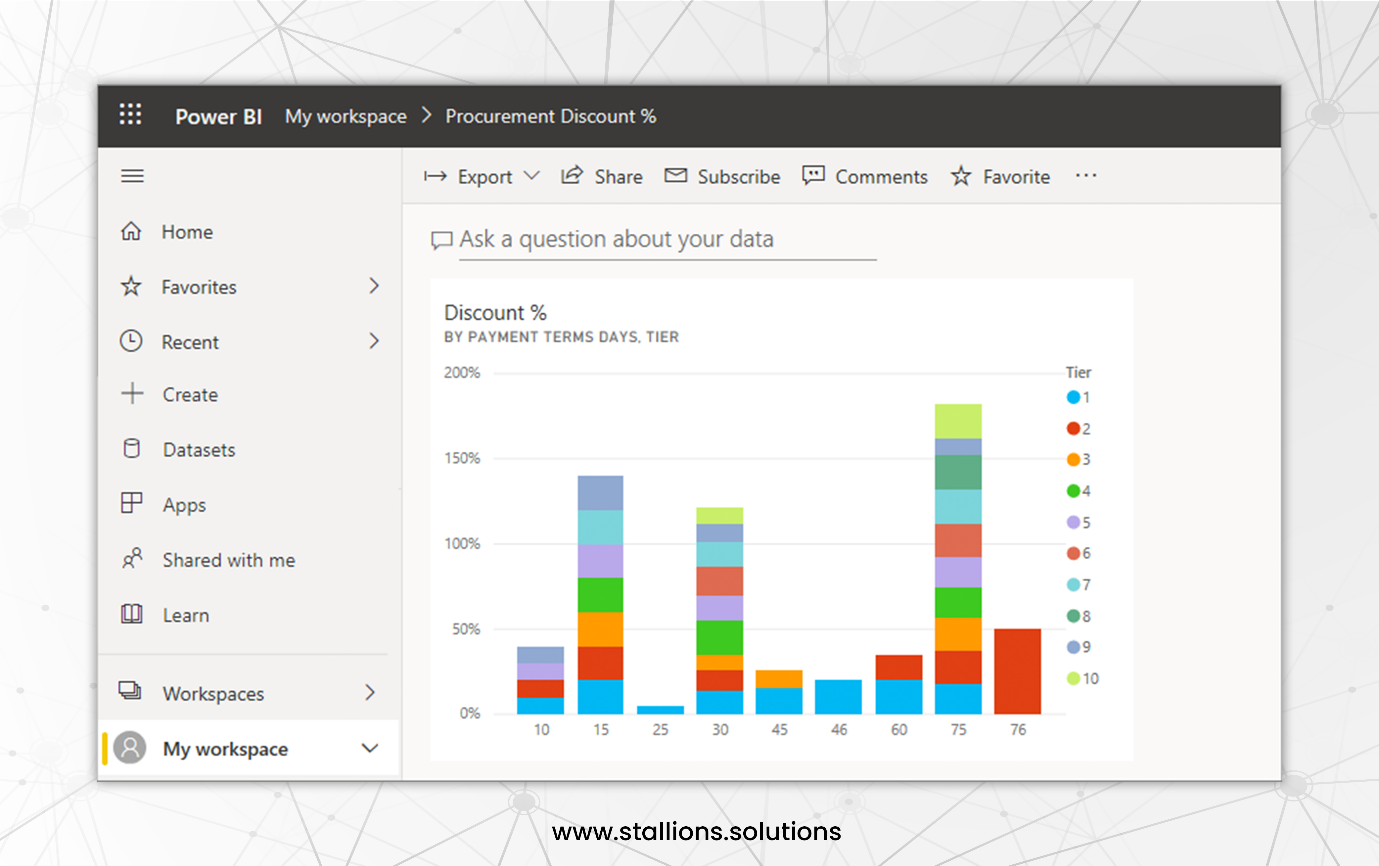
To go back to the report, select the tile. Additional tiles can be added to the new dashboard by pinning them. When the “Pin to dashboard” dialogue box displays, choose “Existing dashboard.”
There you go. You’ve created your first dashboard!
Create your Interactive Dashboard
With this information in hand, it’s time to put your skills to the test and create your first interactive dashboard right now! Power BI can help you extract insightful knowledge from your data, regardless of your role in the organization—a business professional seeking to make data-driven decisions, a data enthusiast looking into the area of analytics, or anybody in between.
The more Power BI you use, the more skilled you’ll get at producing informative and engaging data visualizations. Explore the limitless possibilities of Power BI, dive into your data, and create your first interactive dashboard. Convert your data into insights, then use them to steer clear of poor judgments and towards a better-informed future.
Contact us to connect with our team of Power BI experts. Whether you have questions or need expert guidance with your data projects, we support your success. Let’s work together to turn your data into useful insights.