
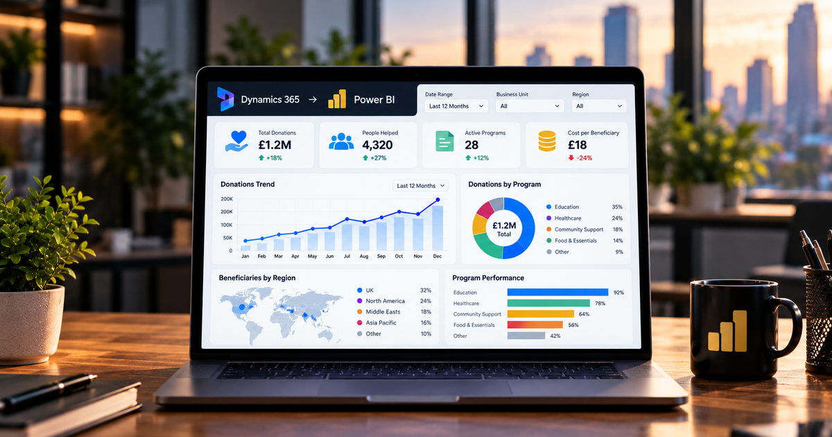
A gold mine is buried in your Dynamics 365 system. The problem is that the questions your leaders keep asking rarely fit on a single Dynamics screen.
“What’s our pipeline coverage by region against case backlog?” “How’s forecast accuracy trending by sales manager?” Answers like those cut across sales, service and finance, and they live in Power BI, sitting on top of the same data that runs your CRM.
So this is about taking that operational data and turning it into live dashboards that leaders genuinely read, and the sharper decisions that follow.
Why the Built-In Dashboards Aren’t Enough
To be fair to Dynamics 365, its built-in views and charts do the job well for those who live in the system all day, checking cases, updating opportunities, and working their queue.
They weren’t built to answer the questions leadership fires at those people. The minute your CRM stops being a contact list and becomes the operational heart of the business, the questions go cross-functional, covering pipeline coverage by service region, case backlog against active opportunities, and forecast accuracy by manager.
None of that sits in a single Dynamics view. It needs a proper reporting layer, and that’s precisely what Power BI is.
The good news? No BI pairing in the Microsoft world is tighter than this one. Power BI and Dynamics 365 sit in the same cloud, use the same sign-in, and share the same underlying data platform: Microsoft Dataverse.
The Foundation Everything Sits On
Get one thing straight up front. Every Dynamics 365 app (Sales, Customer Service, Finance, Supply Chain, Field Service) stores its data in Dataverse. So do every model-driven Power App and every Copilot Studio agent. Dataverse is the shared backbone, and Power BI plugs into it.
That’s why the whole thing feels so native. You can embed Power BI reports directly into Dynamics 365 forms, dashboards and views, with no second login required. Yet most organisations barely scratch the surface.
Choosing How to Connect, This Is Where It Matters
Get this right, and the dashboard flies. Get it wrong, and you can quietly grind your live system to a crawl. There are three main routes, and which one fits depends on two things: how much data you’re dealing with and how fresh it has to be.
Most people reach for the native Dataverse connector, and for most organisations, that’s the right shout. It’s free with licences you already hold, and it shrugs off most CRM and ERP volumes.
You get two modes inside it. Import mode caches the data in Power BI and refreshes on a schedule, which feels snappiest for the people reading the report. DirectQuery fetches data live every time, so it’s always current, but it drags as your tables balloon, and it can start throttling the production system your teams are working in.
Then there’s Synapse Link and Fabric Link, which exist to fix scale. When your data gets too big for the connector, these copy Dataverse off into a separate analytical store built for heavy lifting, so you’re not leaning on the live system your sales and service people depend on.
Weighing that up is exactly the sort of call our BI and Data Science services exist to get right, and it ties straight into the wider ETL versus ELT question of how you move and shape data in the first place.
The Secret to a Dashboard People Actually Use
The connector you pick isn’t what makes a dashboard genuinely useful rather than a report nobody opens twice. Design is.
The classic mistake is cramming everything onto the screen. The best executive dashboards do the opposite: they focus on a few metrics linked to real decisions—pipeline coverage, win rate, case backlog, and days sales outstanding—and take less than a minute to read.
If a leader can’t tell where the business stands at a glance, the dashboard has failed, however clever the model behind it.
That kind of clarity depends on solid data modelling behind the scenes. Dataverse stores data in a normalised entity model that works well for CRM but can be awkward for reporting. The key is reshaping those entities into a clean star schema—the structure Power BI was built for—so reports stay fast and the numbers remain believable.
Where AI Fits In
There’s also a forward-looking reason to nail this foundation. Clean, well-modelled Dynamics 365 data in Power BI isn’t only feeding human dashboards these days.
Copilot in Power BI lets people quiz their data in plain English, and the AI agents now spreading through Dynamics 365 rely on this exact kind of unified, trustworthy data to reason and act.
A solid reporting layer today is the groundwork for AI-driven insight tomorrow. Sort the data foundation, and everything sitting on top of it – dashboards, Copilot, agents – works better.
Conclusion
Your Dynamics 365 data is only as valuable as the decisions it drives. Locked away in operational screens, much of that value sits untapped. Power BI sets it free, turning the data your business already churns out into live dashboards that answer the cross-functional questions leaders genuinely ask.
The technology to connect them is mature, and most organisations already pay for it. The real work is choosing the right connection method, modelling the data properly, and designing dashboards with enough discipline to be genuinely useful. Do that, and reporting stops being a chore and becomes a real edge.
As an ISO 27001–certified Microsoft partner, Stallions Solutions builds Power BI reporting for Dynamics 365 that’s fast, accurate and built to scale.
Book a free assessment, and we’ll help you turn your data into decisions- honest advice, no hard sell.
Frequently Asked Questions
How do I connect Power BI to Dynamics 365?
Most organisations use the native Dataverse connector, which is included with existing licences at no extra cost. Connect Power BI to your Dataverse environment to model the data, create visuals, and publish them to the Power BI service. You can also embed reports in Dynamics 365.
What’s the difference between Import and DirectQuery mode?
Import mode caches data in Power BI and refreshes it on a schedule for fast performance. DirectQuery retrieves live data from Dataverse to keep it current, but it’s slower and can throttle your production system as data grows, so it’s used more selectively.
When should I use Synapse Link or Fabric Link instead of the connector?
When your data volume or refresh needs outgrow the native connector, these replicate Dataverse into a separate analytical store designed for large-scale analytics, without impacting the live system your teams use.
Can Power BI reports appear inside Dynamics 365?
Yes. Since they share the same platform, Power BI reports can be embedded directly in Dynamics 365 forms, dashboards, and views without requiring a separate login.
What makes a good executive dashboard?
Focus. Choose a few metrics that inform real decisions, make them understandable in under a minute, and build on a clean star schema to keep the data fast and reliable. Less is almost always more.